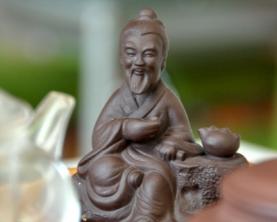
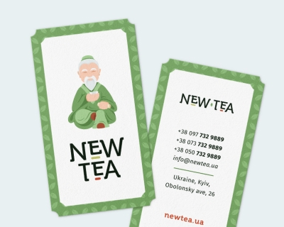
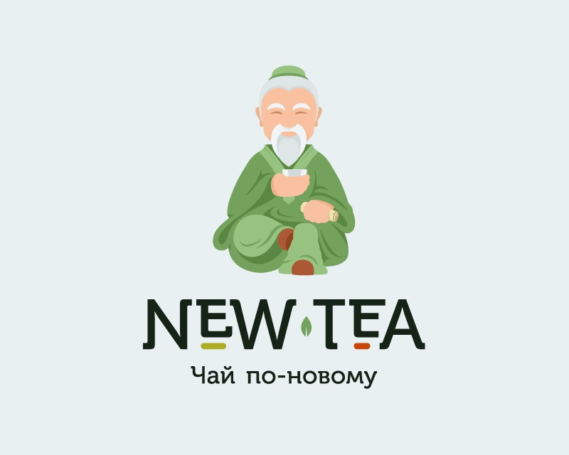
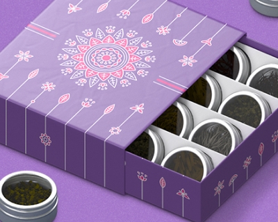
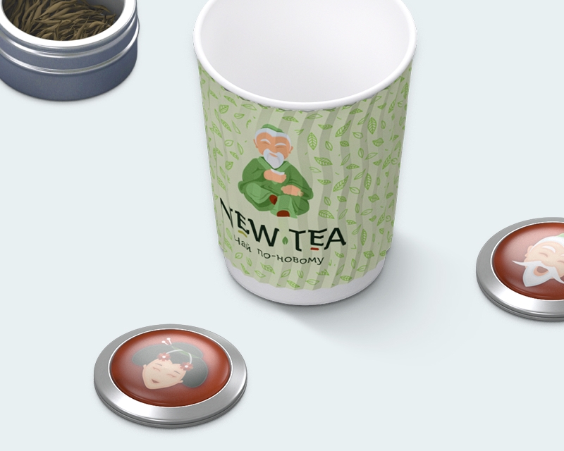
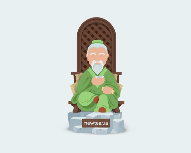
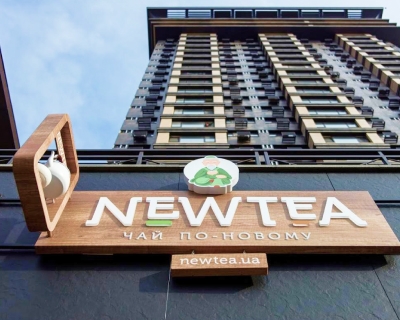
A corporate style
for the tea brand from scratch

Chinese tea is not a basic necessity. The taste is for connoisseurs, the price is expensive, there are a lot of competitors. Therefore, the identity should help the tea brand to be correctly recognized at any point of contact with a customer.

AND NO DRAGONS!
We were for our customer's suggestions that we had to avoid classic Chinese attributes such as red and gold colors and dragons. The traditional Chinese style does not fit the brand that propagates brewing tea in straits by technological devices. Therefore we were inspired by European design, eco, craft and minimalism. Olesya and Zhenya approved the concept at first sight.
Logo is a stylized image of Lu Yu 陸羽, the author of the treatise about tea
30+
application formats:
signboards, stickers,
gift packages
as well as White Label branding
We are focused on points of interaction of the brand with customers
EUGENIA
Creative director
Sometimes you get to know the project and a chemistry happens
Our chemistry appeared with a first sip. I can not recall exactly that sip (it seems to me it was Tie Guan Yin, Iron Goddess of Mercy oolong), magic took place. We absolutely realized that NewTea has a great future and we wanted to be the part of it. We succeeded in design right away because colors, typography, shapes, icon style were great.
Do you have a similar
goal?
DISCUSS