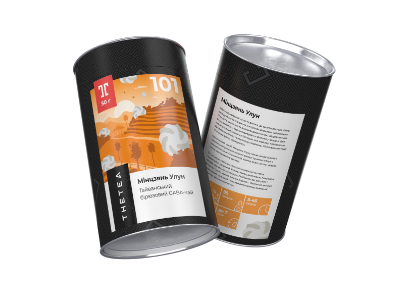
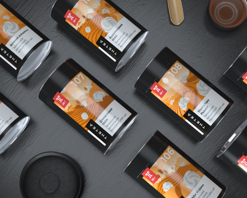
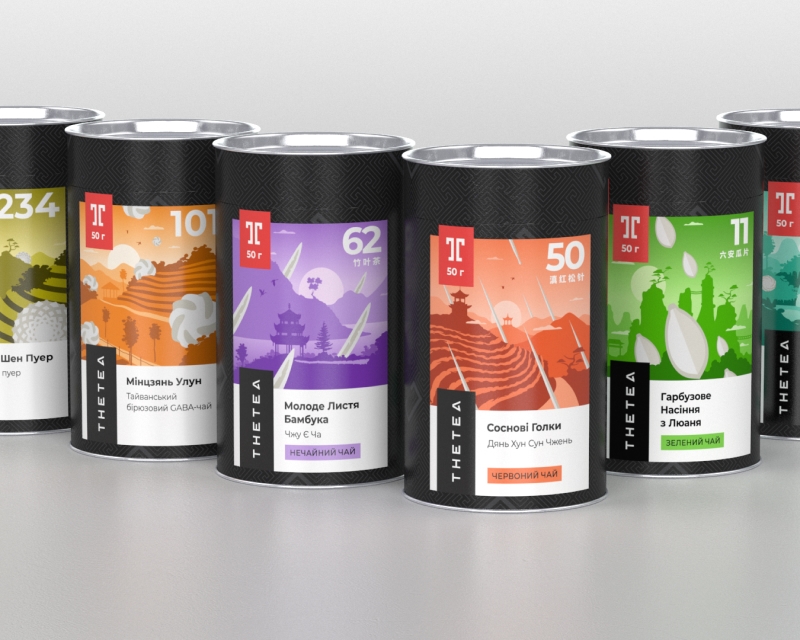
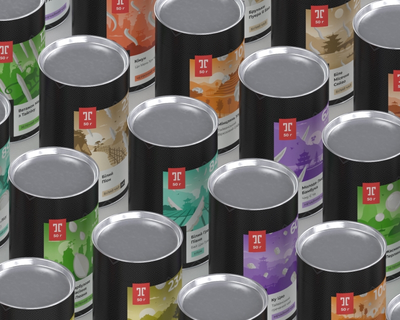
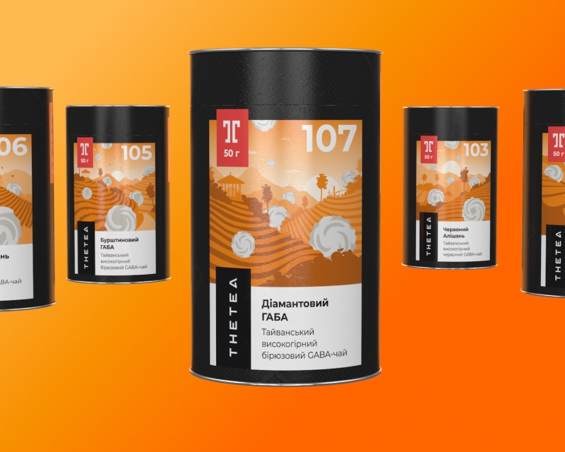
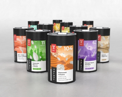
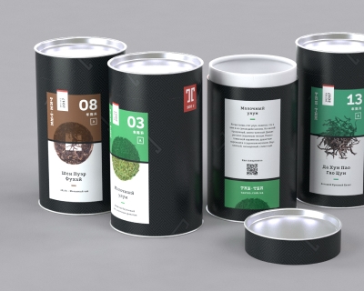
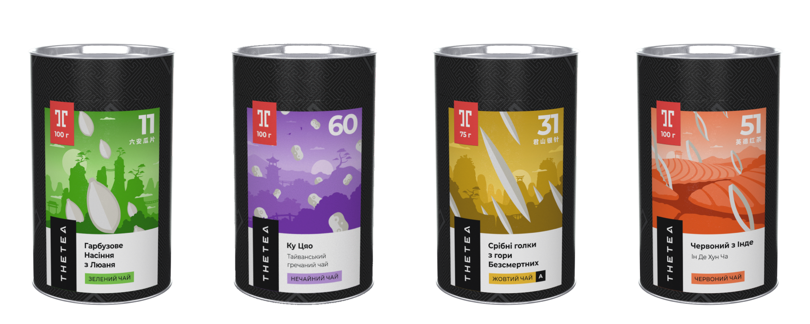
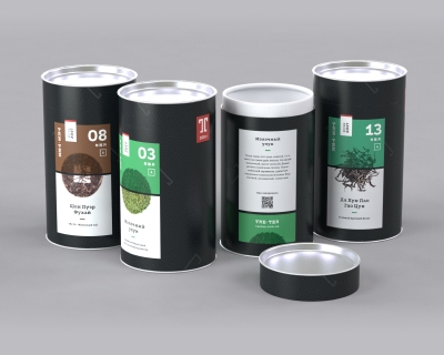
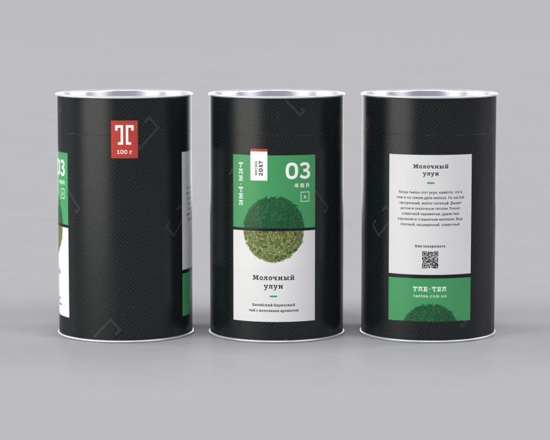
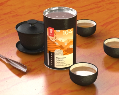
More than 100 packages for various types of teas in six categories are based on visualization of tea harvesting sites.
Mount of Immortals or the Taiwan Island?
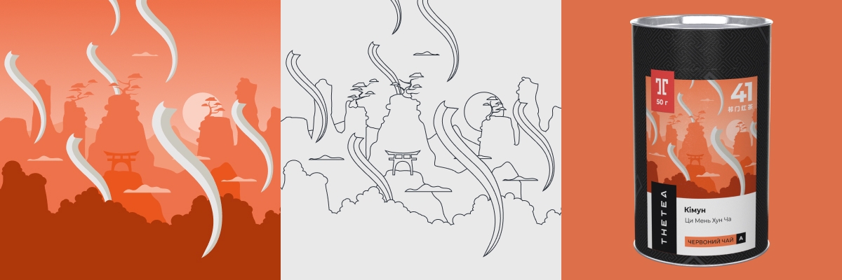
To design the illustrations on the labels, we used images and landscapes of the provinces or regions in which each type of tea grows.
The actual tea leaf shape correlates with the graphic elements in the illustrations.
Each of the 6 product categories is color coded
100
vector illustrations
It took only two iterations for the concepts to find the right way
Modularity of illustrations has reduced production budget
Andrew
Art Director
Detailed and atmospheric style
It was important for us to make each sticker unique, but in such a way as to keep a single collection belonging. For this we have created a special design development process – a modular environment with a number of typical rules for positioning and placing components. This allowed us not only to complete the main task, but also to render all the packages faster than planned.